Category: Statistics

  • Hi pleas I need help for my homework

    Progress Check

    Use this activity to assess whether you and your peers can:

    • Use histograms to compare shape, center, and spread in the distribution of a quantitative variable for two groups of individuals.

    Directions

    Use the drop-down menu to learn about the three steps needed to complete this assignment.

    Three steps to complete the assignment

    Step 1: Review the Rubric

    • Before you submit your work, review the rubric at the bottom of this assignment.
    • Use the rubric as a checklist to determine whether you are ready to submit your work.

    Step 2: First Draft

    • Commit a good-faith effort to address each item in the Prompt section below.
    • Please be sure to number your responses and include “white space” between problem numbers. This improves the readability and flow of your work. I cannot give feedback and grade jumbled work.
    • Use either of the following options to submit your work.
      OPTION 1: You can submit a text-entry assignment (i.e. typing your answers in Canvas). To learn how to submit a text-entry assignment, use these (opens in a new tab).
      OPTION 2: You can upload your paper-and-pencil work (or the digital equivalent). To learn how to upload your paper-and-pencil work, use these (opens in a new tab). WARNING – some file types may not be visible on my end. So to learn which files you can upload, be sure to use the directions link I provided for this option.
    • Not ready to submit a good-faith effort yet? Avoid frustration – use the link to the Questions, Answers, & Tips discussion board (at the bottom of this page) to post questions about this assignment (or visit the discussion board to answer your classmates’ questions). You can also contact me directly (see the homepage for my contact information).

    Step 3: Optional Final Draft

    • After you submit your good-faith attempt to fully respond to the questions in the Prompt section below, advance to the ANSWER(S) page.
    • You can use the ANSWER(S) page to correct your work and resubmit this assignment any time before I begin grading the problems. However, to earn full credit, you are not required to submit a final draft for this assignment. But if you do submit a final draft, I will only grade it if you submitted a good-faith effort on your first draft.
    • Warning – I will only grade your most recent submission. So if you choose to submit a final draft, please do not leave anything out, and please do not direct me to read an earlier submission. To maximize your score, your most recent submission (at the time I begin grading) must be complete.

    Context

    Students researching backpack weights gathered data from 45 elementary school children in the 3rd and 5th grades. The variable is percent of body weight carried in the school backpack. So a child who weighs 60 pounds and carries 9 pounds has a variable value of 15% (9 60 = 0.15 = 15%). The American Chiropractic Association (ACA) recommends that children carry no more than 10% of their body weight.


    Prompt

    When we analyze backpack weight as a percentage of body weight, how do 3rd and 5th graders compare? Are children in this study following the ACA recommendation?
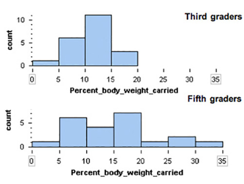
    distribution of percent-of-body-weight carried: stacked histograms (3rd graders, 5th graders)

    Percent of Body Weight Carried
    % of body weight carried in backpack Third
    graders
    Fifth
    graders
    0-5% 1 1
    5-10% 6 6
    10-15% 11 4
    15-20% 3 7
    20-25% 0 1
    25-30% 0 2
    30-35% 0 1
    Totals 21 22

    Note: Left-hand end-points are included in each bin. So the 2nd bin contains students carrying 5% of their body weight.


    Module 7 Discussion Board

    Use the Module 7 (opens in a new tab) to ask questions or provide feedback about the problems in any Module 7 activity – including this peer-reviewed assignment.


    Review Feedback

    • Instructor feedback is only available after an assignment is graded.
    • Use these (opens in a new tab) to learn how to review feedback.

    Click the “Next” or > button to continue.

    Content by Cuyamaca College math faculty and licensed under the .

    Rubric

    Formative Assessments

    Formative Assessments

    Criteria Ratings Pts

    This criterion is linked to a Learning OutcomeAnswering the Prompt

    10 ptsFull CreditThe first submission demonstrates a good-faith effort to address each part of the Prompt. Either in the first draft or the optional final draft, all parts of the “Prompt” are addressed and the responses demonstrate attainment of the learning objectives in the “Progress Check” section of the assignment. The answers are correct. The writing/work is clear. The explanation/work is reasonable, well-organized, and easy to follow.8.5 ptsMostly CorrectThe first submission demonstrates a good-faith effort to address most of the Prompt. In the optional final draft all parts of the “Prompt” are addressed, and the responses demonstrate attainment of the learning objectives in the “Progress Check” section of the assignment. The answers are mostly correct. The writing/work is clear. The explanation/work is reasonable, well-organized, and easy to follow.

    6 ptsOne or more incorrectThe first submission demonstrates a good-faith effort to respond to a smaller portion of the Prompt. In the first draft or the optional final draft, one or more parts of the “Prompt” are not addressed or are incorrect. Or, answers do not demonstrate attainment of the learning objectives in the “Progress Check” section of the assignment. Or, answers are correct, but the writing/work is unclear, incorrect, or difficult to follow.0 ptsNo MarksThe first submission does not demonstrate a good-faith effort to address the Prompt.

    10 pts

    Total Points: 10

    Requirements: 5 h

  • NUR6930 UF Week 6 Introduction to G*Power Discussion

    1. Use the attached article and discuss its statistical concepts in light of what we have covered in class so far. Use the questions below as a guide to structure your discussion. While these questions should inform your analysis, do not address them in a simple question-and-answer format. Instead, synthesize your discussion based on these prompts and any additional relevant concepts.
    2. Cite at least two APA references in addition to the provided article. Your textbook (Required Text): Heavey, E. (2024). Statistics For Nursing: A Practical Approach (4th ed.). Jones & Bartlett Learning, LLC, and other scholarly articles are acceptable sources. Ensure you reference the attached article appropriately and adhere to APA format for citations and references.

    Note:
    The article includes statistical concepts that will be covered later this semester. For this discussion, focus only on the material we have learned so far.

    Guiding Questions:

    • What levels of measurement are included in the article?
    • Are charts used appropriately? What other types of charts could have been used?
    • What descriptive statistics are included, and what others could have been added?
    • Discuss the potential for Type I and/or Type II errors in the context of the article.
    • Comment on the statistical significance of some of the results
    • Required Text: Heavey, E. (2024). Statistics For Nursing: A Practical Approach (4th ed.). Jones & Bartlett Learning, LLC.

    Requirements: I need the discussion to cover the listed instructions

  • Quantitative Analysis EdD

    Please help me complete this Quantitative Analysis Assignment. I have attached all needed materials, so please let me know if you have any questions.

    Requirements: 5-6 pages

  • Descriptive statistics

    Im not good in stats. Im looking for a statistic major or someone who knows statistics very well Ill post a screenshot of the homework prompt also the statistics data sheet that youll be writing on.
  • MAT 240 Project Two Guidelines and Rubric

    Competency

    In this project, you will demonstrate your mastery of the following competency:

    • Apply statistical techniques to address research problems
    • Perform hypothesis testing to address an authentic problem

    Overview

    In this project, you will apply inference methods for means to test your hypotheses about the housing sales market for a region of the United States. You will use appropriate sampling and statistical methods.

    Scenario

    You have been hired by your regional real estate company to determine if your regions housing prices and housing square footage are significantly different from those of the national market. The regional sales director has three questions that they want to see addressed in the report:

    1. Are housing prices in your regional market lower than the national market average?
    2. Is the square footage for homes in your region different than the average square footage for homes in the national market?
    3. For your region, what is the range of values for the 95% confidence interval of square footage for homes in your market?

    You are given a real estate data set that has houses listed for every county in the United States. In addition, you have been given national statistics and graphs that show the national averages for housing prices and square footage. Your job is to analyze the data, complete the statistical analyses, and provide a report to the regional sales director. You will do so by completing the Project Two Template located in the What to Submit area below.

    Directions

    Introduction

    1. Region: Start by picking one region from the following list of regions:
    2. West South Central, West North Central, East South Central, East North Central, Mid Atlantic
    3. Purpose: What is the purpose of your analysis?
    4. Sample: Define your sample. Take a random sample of 500 house sales for your region.
    5. Describe what is included in your sample (i.e., states, region, years or months).
    6. Questions and type of test: For your selected sample, define two hypothesis questions (see the Scenario above) and the appropriate type of test for each. Address the following for each hypothesis:
    7. Describe the population parameter for the variable you are analyzing.
    8. Describe your hypothesis in your own words.
    9. Identify the hypothesis test you will use (1-Tail or 2-Tail).
    10. Level of confidence: Discuss how you will use estimation and confidence intervals to help you solve the problem.

    1-Tail Test

    1. Hypothesis: Define your hypothesis.
    2. Define the population parameter.
    3. Write null (Ho) and alternative (Ha) hypotheses. Note: For means, define a hypothesis that is less than the population parameter.
    4. Specify your significance level.
    5. Data analysis: Summarize your sample data using appropriate graphical displays and summary statistics and confirm assumptions have not been violated to complete this hypothesis test.
    6. Provide at least one histogram of your sample data.
    7. In a table, provide summary statistics including sample size, mean, median, and standard deviation. Note: For quartiles 1 and 3, use the quartile function in Excel:
    8. =QUARTILE([data range], [quartile number])
    9. Summarize your sample data, describing the center, spread, and shape in comparison to the national information (under Supporting Materials, see the National Summary Statistics and Graphs House Listing Price by Region PDF). Note: For shape, think about the distribution: skewed or symmetric.
    10. Check the conditions.
    11. Determine if the normal condition has been met.
    12. Determine if there are any other conditions that you should check and whether they have been met. Note: Think about the central limit theorem and sampling methods.
    13. Hypothesis test calculations: Complete hypothesis test calculations.
    14. Calculate the hypothesis statistics.
    15. Determine the appropriate test statistic (t). Note: This calculation is (mean target)/standard error. In this case, the mean is your regional mean, and the target is the national mean.
    16. Calculate the probability (p value). Note: This calculation is done with the T.DIST function in Excel:
    17. =T.DIST([test statistic], [degree of freedom], True) The degree of freedom is calculated by subtracting 1 from your sample size.
    18. Interpretation: Interpret your hypothesis test results using the p value method to reject or not reject the null hypothesis.
    19. Relate the p value and significance level.
    20. Make the correct decision (reject or fail to reject).
    21. Provide a conclusion in the context of your hypothesis.

    2-Tail Test

    1. Hypotheses: Define your hypothesis.
    2. Define the population parameter.
    3. Write null and alternative hypotheses. Note: For means, define a hypothesis that is not equal to the population parameter.
    4. State your significance level.
    5. Data analysis: Summarize your sample data using appropriate graphical displays and summary statistics and confirm assumptions have not been violated to complete this hypothesis test.
    6. Provide at least one histogram of your sample data.
    7. In a table, provide summary statistics including sample size, mean, median, and standard deviation. Note: For quartiles 1 and 3, use the quartile function in Excel:
    8. =QUARTILE([data range], [quartile number])
    9. Summarize your sample data, describing the center, spread, and shape in comparison to the national information. Note: For shape, think about the distribution: skewed or symmetric.
    10. Check the assumptions.
    11. Determine if the normal condition has been met.
    12. Determine if there are any other conditions that should be checked on and whether they have been met. Note: Think about the central limit theorem and sampling methods.
    13. Hypothesis test calculations: Complete hypothesis test calculations.
    14. Calculate the hypothesis statistics.
    15. Determine the appropriate test statistic (t). Note: This calculation is (mean target)/standard error. In this case, the mean is your regional mean, and the target is the national mean.]
    16. Determine the probability (p value). Note: This calculation is done with the TDIST.2T function in Excel:
    17. =T.DIST.2T([test statistic], [degree of freedom]) The degree of freedom is calculated by subtracting 1 from your sample size.
    18. Interpretation: Interpret your hypothesis test results using the p value method to reject or not reject the null hypothesis.
    19. Compare the p value and significance level.
    20. Make the correct decision (reject or fail to reject).
    21. Provide a conclusion in the context of your hypothesis.
    22. Comparison of the test results: Revisit Question 3 from the Scenario section: For your region, what is the range of values for the 95% confidence interval of square footage for homes?
    23. Calculate and report the 95% confidence interval. Show or describe your method of calculation.

    Final Conclusions

    1. Summarize your findings: In one paragraph, summarize your findings in clear and concise plain language.
    2. Discuss: Discuss whether you were surprised by the findings. Why or why not?

    You can use the following tutorial that is specifically about this assignment:

    Attached Files (PDF/DOCX): MAT 240 Creating Histograms in Excel (1).pdf, MAT 240 Descriptive Statistics in Excel (1).pdf, MAT 240 Scatterplots in Excel Tutorial.pdf, MAT 240 Random Sampling in Excel Tutorial.pdf, National Summary Statistics and Graphs House Listing Price by Region.pdf, MAT 240 Project Two Template.docx

    Note: Content extraction from these files is restricted, please review them manually.

  • Whats Wrong With This Picture ?

    please review the discussion instructions from the screenshot below and follow through with finding the information online to complete the discussion post.. furthermore please use the information from the two texts via pdf from the book Elementary Statistics : Picturing the world by Ron Larson. pls use APA 7th ed

    Attached Files (PDF/DOCX): stats22.pdf, stats21.pdf

    Note: Content extraction from these files is restricted, please review them manually.

  • stats project

    Refer to the attached Project Template and Project Data Generator documents to complete this project.

    The Word document is where you will write all your responses. The Excel file generates your personalized dataset and is used for all required calculations and statistical analyses. Both files are essential for completing the assignment.

    Submission Instructions:

    You must upload both Word and Excel files upon completion. Before submitting, rename your files using the following format:

    • YourFirstName_YourLastName_MAT-274_Project.docx
    • YourFirstName_YourLastName_MAT-274_Project.xlsx

    While external sources are not required for this project, if you do use any, please include basic in-text citations or footnotes. This project is designed to be self-contained, so formal citations are only necessary if external material is referenced.

    This assignment uses a rubric. Please review the rubric prior to beginning the assignment to become familiar with the expectations for successful completion.

    APA style is not required, but solid academic writing is expected.

    You are required to submit this assignment to LopesWrite. A link to the LopesWrite technical support articles is located in Class Resources if you need assistance.

    Requirements: as instructed

  • Visualizing and interpreting data – answers questions; creat…

    You will use the skills you learned in weeks 1 and 2 evaluate a set of statistics. But keep this in mind, learning statistics is more than learning techniques and tools. It is also about learning how to think critically. That is the essential skill to develop in this course. Associated with critical thinking is the need to present reasoning that explains how you arrived at the conclusions you drew, and to provide evidence that supports your reasoning and conclusions! You must practice this in all of your post and responses for every assignment. Assertions or conclusions that you cannot support with evidence and valid reasoning will, sadly, result in a loss of points.

    A) Determine Descriptive Statistics of Sample Dataset

    Physical variables can be correlated with each other. An Excel spreadsheet is attached that includes 30 data sets illustrating the height and weight of a population segment. The first ui is the height in inches and the second the weight in pounds. Heights and weights are the two variables in the datasets, and each of these variables has a number of observations (values) associated with it. Choose one data set that has not already been selected (include the number of the data set in your title to make this easier to do; see notes section for example).

    i) First provide the definitions of:

    • Mean
    • Median
    • Standard deviation

    ii) Next, calculate the values of mean, median and standard deviation of the a) heights and the b) weights in the data set. You can either do this by hand or see the video linked at the end to show you how to do this using the tools in Excel. Then discuss with each other the questions posed later in this assignment.

    iii) Do the values of the mean, median, and standard deviation tell you anything useful about a dataset? If so, what is that? If you wanted to convey to someone a sense of what the data means, which statistic would you use (mean, median, standard deviation). Explain the reasons for your choice?

    B) Create Plot of Data

    Now, construct a scatter plot. You will use this plot to discuss some of the questions in Part C.

    • Select the Height and Weight columns in a dataset.
    • From the insert menu select the “Scatter” plot (the option with datapoints only and no connecting lines).
    • Right-click on one of the data points in the chart, From the pop-up menu, click on “Add Trendline”. This brings up another menu, A Linear trendline is the default option but you can pick another option as well.
    • Try fitting several of the options. Do you see much of a difference between the different trend lines? Which one do you think gives you a visually better fit? Which one would you choose to use for this plot? Explain your reasoning.

    C) Analyze and Discuss

    Discuss any two of the numbered items below in your main post. Write the response for each item in a separate paragraph and provide the number of the item to which you are responding.

    Note: You must provide logical reasoning for the inferences that you make. If you make an assertion or claim, you must provide reasoning and links to published, reliable evidence to support your assertion/claim.

    1. Observe the scatter plot you built? Does there appear to be a correlation between the height and weight of the subjects? Is it a strong or weak correlation? What reasoning did you use to decide if the correlation is strong or weak.
    2. Right-click on the numbers lining the y-axis. From the menu that pops up, select “Format Axis”. Change the upper and lower bounds for the y-axis. What does this do to the shape of the scatter plot. Does it change your interpretation of the strength of the correlation between the variables? Explain your reasoning. Paste your charts directly in your post.
    3. Explain what is correlation and what is causation? Are the variables in the provided dataset correlated or causally connected? Explain your reasoning.
    4. In creating scatter plots, there is an interpretation bias that gets built in. Identify the bias and discus the difficulty it causes. How would you avoid this bias?
    5. Can you infer anything about the nature of the subject population from the data provided? Explain your reasoning and provide references to reliable published evidence that supports your reasoning.
    6. If you were told that the variables in the dataset were the speed of a car (in miles per hour) and the systolic blood pressure of the driver (in mm of mercury), which variable would you plot on which axis? What conclusion would you draw?
    7. In light of the above questions, what do you think of the notion of “data-driven decision making”? Is data (numbers) sufficient by itself to draw conclusions, i.e. to draw conclusions without knowing what physical things are represented by the data?

    D) Self-Reflection and Responses

    Self-reflection: Describe what you have learned from this exercise about using descriptive statistics and data visualization to understand the information contained in a dataset, and about communicating that information to others.

    Response Posts: Respond to at least two of your classmates by elaborating upon or critiquing the points they make.

    Notes

    If you have a different version of excel then you may want to search to see how to form a trendline. These instructions work with Office 365 and Office 2010.

    • Present your work neatly so that it is easy to read. Separate text into paragraphs. Highlight/bold important points or numbers. Attach your excel worksheet with your scatter plot and paste/insert plots directly into your post. (5 points associated with the presentation of your posts)
    • If you make an assertion or claim, provide supporting evidence (citation to published work) and explain your reasoning. (This is very important. Up to 15 points are associated with this).

    Requirements: Questions answered 250 words +

  • Visualizing and interpreting data – answers questions &…

    You will use the skills you learned in weeks 1 and 2 evaluate a set of statistics. But keep this in mind, learning statistics is more than learning techniques and tools. It is also about learning how to think critically. That is the essential skill to develop in this course. Associated with critical thinking is the need to present reasoning that explains how you arrived at the conclusions you drew, and to provide evidence that supports your reasoning and conclusions! You must practice this in all of your post and responses for every assignment. Assertions or conclusions that you cannot support with evidence and valid reasoning will, sadly, result in a loss of points.

    A) Determine Descriptive Statistics of Sample Dataset

    Physical variables can be correlated with each other. An Excel spreadsheet is attached that includes 30 data sets illustrating the height and weight of a population segment. The first ui is the height in inches and the second the weight in pounds. Heights and weights are the two variables in the datasets, and each of these variables has a number of observations (values) associated with it. Choose one data set that has not already been selected (include the number of the data set in your title to make this easier to do; see notes section for example).

    i) First provide the definitions of:

    • Mean
    • Median
    • Standard deviation

    ii) Next, calculate the values of mean, median and standard deviation of the a) heights and the b) weights in the data set. You can either do this by hand or see the video linked at the end to show you how to do this using the tools in Excel. Then discuss with each other the questions posed later in this assignment.

    iii) Do the values of the mean, median, and standard deviation tell you anything useful about a dataset? If so, what is that? If you wanted to convey to someone a sense of what the data means, which statistic would you use (mean, median, standard deviation). Explain the reasons for your choice?

    B) Create Plot of Data

    Now, construct a scatter plot. You will use this plot to discuss some of the questions in Part C.

    • Select the Height and Weight columns in a dataset.
    • From the insert menu select the “Scatter” plot (the option with datapoints only and no connecting lines).
    • Right-click on one of the data points in the chart, From the pop-up menu, click on “Add Trendline”. This brings up another menu, A Linear trendline is the default option but you can pick another option as well.
    • Try fitting several of the options. Do you see much of a difference between the different trend lines? Which one do you think gives you a visually better fit? Which one would you choose to use for this plot? Explain your reasoning.

    C) Analyze and Discuss

    Discuss any two of the numbered items below in your main post. Write the response for each item in a separate paragraph and provide the number of the item to which you are responding.

    Note: You must provide logical reasoning for the inferences that you make. If you make an assertion or claim, you must provide reasoning and links to published, reliable evidence to support your assertion/claim.

    1. Observe the scatter plot you built? Does there appear to be a correlation between the height and weight of the subjects? Is it a strong or weak correlation? What reasoning did you use to decide if the correlation is strong or weak.
    2. Right-click on the numbers lining the y-axis. From the menu that pops up, select “Format Axis”. Change the upper and lower bounds for the y-axis. What does this do to the shape of the scatter plot. Does it change your interpretation of the strength of the correlation between the variables? Explain your reasoning. Paste your charts directly in your post.
    3. Explain what is correlation and what is causation? Are the variables in the provided dataset correlated or causally connected? Explain your reasoning.
    4. In creating scatter plots, there is an interpretation bias that gets built in. Identify the bias and discus the difficulty it causes. How would you avoid this bias?
    5. Can you infer anything about the nature of the subject population from the data provided? Explain your reasoning and provide references to reliable published evidence that supports your reasoning.
    6. If you were told that the variables in the dataset were the speed of a car (in miles per hour) and the systolic blood pressure of the driver (in mm of mercury), which variable would you plot on which axis? What conclusion would you draw?
    7. In light of the above questions, what do you think of the notion of “data-driven decision making”? Is data (numbers) sufficient by itself to draw conclusions, i.e. to draw conclusions without knowing what physical things are represented by the data?

    D) Self-Reflection and Responses

    Self-reflection: Describe what you have learned from this exercise about using descriptive statistics and data visualization to understand the information contained in a dataset, and about communicating that information to others.

    Response Posts: Respond to at least two of your classmates by elaborating upon or critiquing the points they make.

    Notes

    If you have a different version of excel then you may want to search to see how to form a trendline. These instructions work with Office 365 and Office 2010.

    • Present your work neatly so that it is easy to read. Separate text into paragraphs. Highlight/bold important points or numbers. Attach your excel worksheet with your scatter plot and paste/insert plots directly into your post. (5 points associated with the presentation of your posts)
    • If you make an assertion or claim, provide supporting evidence (citation to published work) and explain your reasoning. (This is very important. Up to 15 points are associated with this).

    Requirements: Questions answered 250 words +

  • Lab 1

    Welcome to the instructions for your first Data Analysis Lab Report Assignment.

    You will learn to use either SPSS or Excel to calculate summary statistics and to create charts as visual aids to compare different industries.

    Step 1: Opening the Data

    Either program is Ok, but make sure that you have either Excel or SPSS already installed on your computer. If you are using a web version of Excel through Office365, first save the file to your machine, and then youll need to upload it to one drive before you will be able to use it for calculations.

    SPSS: simply click on SPSS1_WageswFilter.sav & click download. It will take 15-40 seconds to load depending on your connection and your machine specs. If it take longer no worries.

    Excel: download the SPSS1_WageswFilter.xlsx

    Step 2: Browse the Data.

    Youll notice in the above screenshot that there are several different Occupations [OCC_TITLE] associated with each Major Industry. For example, I have scrolled down to data point 156, which corresponds to ind_Code 19, which is OCC_Title Social Science Research Assistants, which is within the Major Industry Life, Physical, and Social Science Occupations. After learning how to use this software to analyze data and write reports, you will have learned a key basic skill of Social Science Research Assistants. You can see that the hourly wage for people in this field is $24 per hour, and the annual wage of people in this field is $49,030. This is something that you can do with a bachelors degree in sociology, political science, or a related field.

    You can look at the other rows within the Life, Physical, and Social Science Occupations and find other interesting numbers. For instance, Nuclear Technicians earn $38 per hour, about $80,000 in annual wages. Forest and Conservation Technicians earn $19 per hour, or $39,180. Also of note is the number of employees in each field, the TOT_EMP column. There are 31,500 people who work as Social Science Research Assistants, whereas there are only 6,850 people who work as Nuclear Technicians. Now that you understand how to read the relevant fields, browse some other occupations in fields which interest you and find out how much people typically earn who have jobs in your chosen career path. Pick something related to your intended major.

    **Note, if you are using Excel, you will see all the same data on the first worksheet, however the first row is reserved for headings, so the data starts at Row2 instead of Row1. Therefore in the above example, the Social Science Research Assistant is on line 157 instead of 156, everything else you see so far is the same.

    Step 3: Calculate your Summary Statistics. In SPSS, click on Analyze, and then Descriptive Statistics, and then Explore.

    A dialog box will open so that you can indicate which fields you want to analyze. Use the arrows to place Annual Wage into the Dependent List. That is the field with the numbers, youll notice the yellow ruler icon indicates that the annual Wage variable is a interval-ratio measure, meaning it makes sense to calculate descriptive statistics including mean, median, st, dev. Etc.

    The other variable, Factor list, tells the program which variable identifies the separate groups that we want statistics for. MajorIndustry is our factor.

    Click OK and statistics will be generated for the annual wage for each different major industry. In SPSS the statistics will pop-up in a separate window titled Output1.

    ~~~~~~~~~~~~~~

    In Excel, you will see that each of the different industries has the key data separated into different worksheets with tabs at the bottom of the screen.

    Transportation is the first worksheet to the right of the main worksheet. Scroll through the transportation worksheet and notice that the data is in column H in rows 2 through 52. In column I label each of the terms for the descriptive statistics that you wish to calculate. In column J, enter the actual formulas just as we have done in class. For example, for the mean, you would enter =average(h2:h52) . You can see each of the formulas in the screenshots below. Once you have all the formulas and labels in columns I & J, catch your work to make sure the numbers match. Finally, copy and paste the labels and formulas in columns I & J into each of the other worksheets, i.e. Production, InstallRepair, Construction, etc.

    Step 4: Choose 3 Major Industries to write about & carefully read over the results.

    Once you have all of the descriptive statistics, you will need to write about your findings.

    Choose the field in which you have already worked, for example if you have ever had a retail salespersons job, you will see that Retail Salesperson is classified as Sales and Related Occupations Major Industry. So that would be one of your three. Chose one industry based on your intended career choice. For example, if you intend to work as a Hearing Aid Specialist, you would choose Healthcare Practitioners and Technical Occupations. If you dont find the exact career that you are looking for, choose the closest thing to it. If you are looking and dont see it, please let me know and I will suggest a related job.

    Step 5: Use Adobe Express to illustrate the key differences.

    Go to adobe.com/express. Sign in or create an account. (use your WSSU email/canvas login)

    Under Create a new project, click on Flyer or Infographic.

    Use a Template or design your own background.

    Add text with the key numbers (mean, st.dev, range, median, etc). Double-click to edit text.

    Add Photos that illustrate your chosen profession. Be creative!

    Click download

    Step 6: Checklist before submitting

    Should have 3 Graphics total that you are turning in

    Graphics includes accurate descriptive statistics of the wages for 3 jobs (1 graphic for each job).

    Graphics describe:

    o a specific occupation student has had

    o a specific occupation student is interested in

    o a specific occupation that you just think would be fun and describes wages for that occupation

    Each graphics includes at least 2 images

    Text is legible

    Text uses creative font/color combination

    Graphic is submitted to Canvas as a PDF

    Writing is original / unique / not a duplicate effort from another student.

    example of what it should look like is also attached

    Attached Files (PDF/DOCX): Lab 1 Adobe Express-1_6827226.docx

    Note: Content extraction from these files is restricted, please review them manually.